First impressions
The first of two posts on this year’s event
Chelsea made me work harder this year.
On the show gardens, the judges are looking for consistency to the designer’s brief, excellence in execution with both the hard and soft landscaping, and horticultural coherence, which would frown upon, for example, grouping plants together which couldn’t possibly flourish in the same conditions in a real garden. (In fact, if you want to know exactly what the judges are looking for, you could do worse than listen to the first episode of the Virgin Gardener Podcast, where Laetitia and I get the goods straight from the horse’s mouth. Or at least, directly from RHS judge James Alexander-Sinclair, which is more or less the same thing.)
So much for the official process. Like most people when it comes to Chelsea, I’m looking for gardens I’d like to hang out in. These are the gardens that offer a shot of undiluted delight straight into the brain’s reward circuit, gardens of instant gratification. I am a lazy animal, and lazy animals like to get their kicks with as little effort as possible. But, ascending the mental effort gradient a little, there are those gardens I might not be able to picture myself hanging out in, but from which I can pinch ideas to incorporate into a garden where I would feel comfortable (unapologetically, back to comfort in the garden because, after all, who chooses to sit in a patch of nettles when there’s a nice grassy knoll at hand?). And then, if there’s none of that, I ratchet up the mental effort’O’meter for those gardens where it’s both interesting and illuminating to wonder why I’m finding things such a challenge; where tracking down the cause of my discomfort might just tell me something about myself, how I relate to my surroundings, and how that might play out in my gardening activities.
There was a lot of this latter kind of thing at Chelsea for me this year. To the extent that, by the end of press day, it wasn’t only my feet that were aching, but the little grey cells too.
Gone are the big lawns. There’s usually a goodly few neatly manicured, large green swards dotted around, giving your brain time to take stock and make sense of everything you’re seeing. Of course, you don’t need a lawn for that. The same effect can be achieved just as well, if not better, with an expanse of paving or some other hard landscaping material. Blank space thinky time…fluffy bits round the edges to ooh and aah over. This year, it was busy – plants everywhere, in huge drifts, crammed into spaces in walls, springing up from gravel, arranged in imposing ranks of spires. There was even a chamomile lawn which looked like a green yeti had decided to lie down for a quick nap. No thinking time, just plants, plants, plants, coming at you. It was full on.
One of the reasons this isn’t done particularly often, is it’s very hard to do well in a show garden. To an extent the effect has been made far easier to achieve with species that are suitable for inclusion in a wildflower turf mix, such as you might see on the more naturalistic looking gardens, but to plant individual specimens in pots (which many of them are) in anything resembling realistic plant communities is a skill in itself and, when it’s done well, the result feels like a garden in possession of a past. But when it’s not finessed, it feels like a slightly frigid container planting.
Where it was done well…
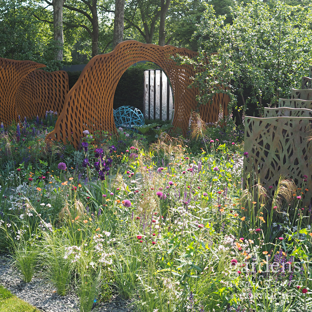
Sarah Price’s planting always takes my breath away – she has such an eye for plants with graceful beauty but also strength. Though not a garden which will strike people as traditionally “pretty”, the M&G garden is the perfect showcase for what she does, and will reward time spent admiring the planting and the geometry of the spaces she has created. There are so many little corners I’d like to sit in with a book and lose an hour or two while the sun moves round.
Detail from the M&G garden designed by Sarah Price, RHS Chelsea Flower Show 2018
Detail from the M&G garden designed by Sarah Price, RHS Chelsea Flower Show 2018
Detail from the M&G garden designed by Sarah Price, RHS Chelsea Flower Show 2018
Jo Thompson does many things well, and one of her strengths seems to be reflective retreats in which water is a key feature. The planting in the Wedgwood Garden was delicate and naturalistic, but with just the right amount of colour to pop.
Detail from the Wedgwood garden designed by Jo Thompson, RHS Chelsea Flower Show 2018
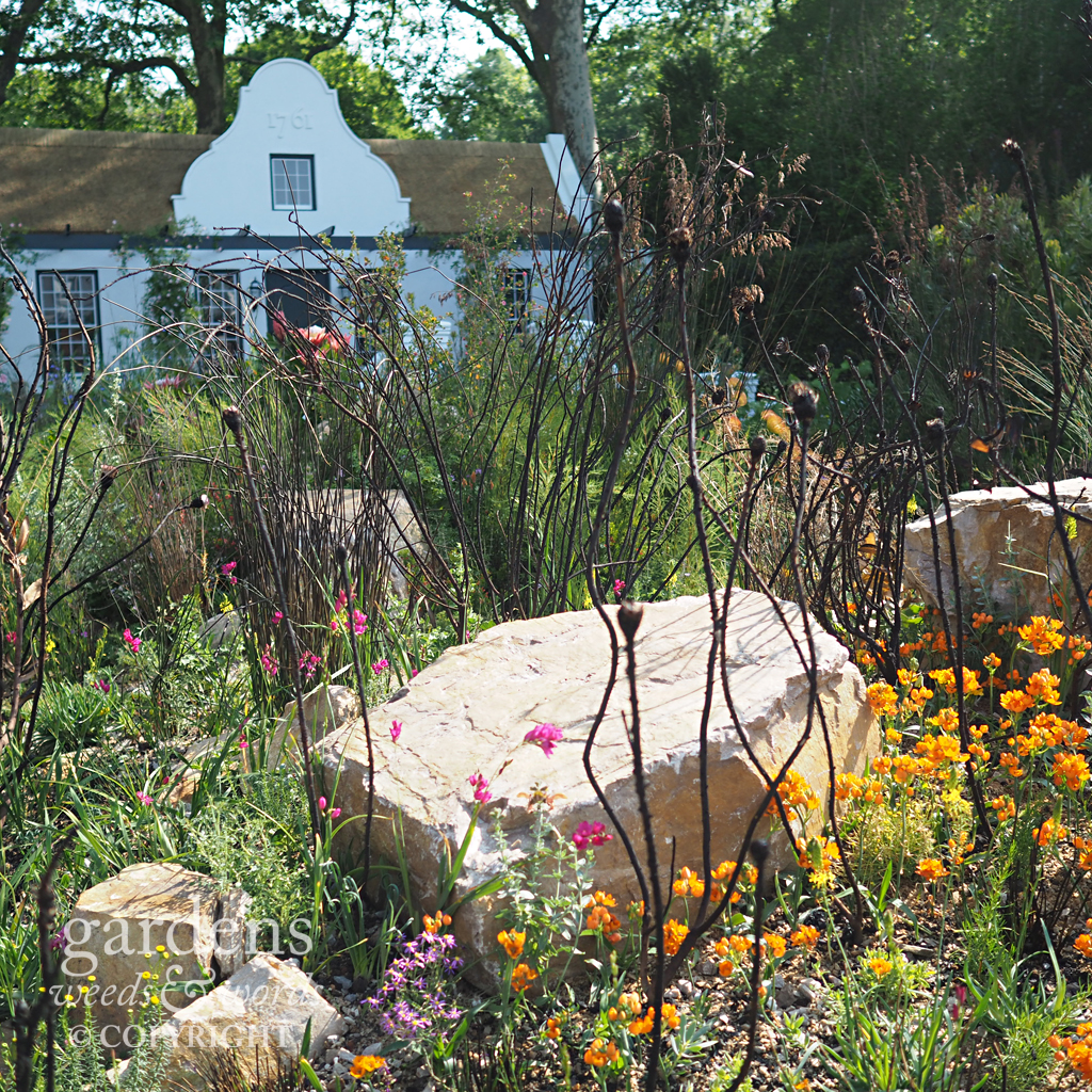
The Trailfinders South African garden by Jonathan Snow quite blew my gardening socks off when I viewed it end on from Main Avenue, with its depiction of the rugged fynbos landscape. Proteas, knifophia and agapanthus are all jostling for space with pelargoniums and leonotis among the rocks in a semi-arid environment. I absolutely loved the attention to detail and the depth of the planting, becoming more lush as you move into the garden, away from the wilder landscape and towards the house.
Detail from the Trailfinders South Africa garden designed by Jonathan Snow, RHS Chelsea Flower Show 2018
There is, then, a level of detail in the planting that’s required in order for you to suspend disbelief and experience momentarily the showpiece as a real garden. In the David Harber & Saville garden, this was present in the middle of the plot, but sadly seemed to peter out a little towards the edges, frustratingly those edges nearest to the viewer. So, while there were many strong structural elements in a garden – which admittedly had to wrestle with a truly cosmic concept (the description describes “mankind’s evolving relationship with the environment”, “pivotal wormholes” and “a theoretical space-time passage”, for much of which I’m sure ointment is available), and the planting really did have moments of glorious movement and colour and even delicacy – it didn’t quite inform the entirety of the garden.
Detail from the David Harber and Saville garden, RHS Chelsea Flower Show 2018
The conceptual
Any design, to give it some integrity, needs to have an element of underlying concept, and it’s a measure of the designer’s skill as to how this is manifest in the final piece. It can be woven effortlessly through garden, barely apparent, or sit heavily upon it, and there are times when either approach might be appropriate.
The Pearlfisher Garden by Karen Welman and John Warland was unashamed in its presentation of a garden allegory for the sorry state of our plastic-filled oceans, combining terrestrial succulent plants in a representation of coral formations, around tanks filled with fish and aquatic plants, set in stone paving with visible fossils, the gaps between slabs filled with crushed shells, and patches of Lithops like some kind of sea urchin. Around the wall, a line from Ariel’s melancholy song from The Tempest set the tone, while the ends of plastic bottles perforated the walls. A worthy message, but what’s it got to do with making “Space to Grow” – the section of the show ground in which it appeared? Two things spring immediately to mind – the almost perfect synergy between indoor, or restricted outdoor space gardening, and succulents and air plants, and an increased awareness among the very demographic most effected by elevated housing prices about plastic waste, which is already showing signs of influencing the horticultural industry in terms of the attitude to packaging and waste. Not to a degree in which anyone should feel complacent, but the pressure is on to seek out biodegradable, sustainable materials rather than simply choosing the easiest option.
Detail from the Pearlfisher garden designed by Karen Welman and John Warland RHS Chelsea Flower Show 2018
Detail from the Pearlfisher garden designed by Karen Welman and John Warland RHS Chelsea Flower Show 2018
Naomi Ferrett-Cohen’s Cherub HIV garden: A Life Without Walls was one of those gardens based on a journey through a process experienced by someone afflicted by a mental or physical condition – highlighting, in this case, the possibility of living a life openly and healthily with HIV. Amongst other devices, it used the symbolism of a path and a broken wall, and a colour palette restricted to white and grey in the hard landscaping, transitioning from white and green in the planting at one end to plum coloured lupins, purple and yellow aquilegias. The narrative was undeniably worthy, but I was rather more charmed by the dwarf pines, the acer and the white ragged robin.
Detail from the Cherub HIV: A Life Without Walls garden designed by Naomi Ferrett-Cohen RHS Chelsea Flower Show 2018
Detail from the Cherub HIV: A Life Without Walls garden designed by Naomi Ferrett-Cohen RHS Chelsea Flower Show 2018
Also in the Space to Grow section was the Silent Pool Gin garden from David Neale. This featured some beautifully realised hard landscaping, from the Purbeck stone wall, the oak timber deck around the pool and the textured Portland stone paving, and while I loved the cool blues of Anchusas and blue Meconopsis poppies throughout, accented here and there by orange geums and given texture with cow parsley (you can’t have a Chelsea without Anthriscus), the real lesson for small gardens was the use of large, multi-stemmed shrubs pruned to allow space for underplanting in the dappled shade below, while contributing height and presence to the space.
Detail from the Silent Pool Gin garden designed by David Neale, RHS Chelsea Flower Show 2018
Hard landscaping
The hard landscaping was on point. “It always is”, I was reminded by blogging buddy Sarah Shoesmith of the Gardening Shoe blog, as we grabbed a bite to eat with friends. She’s not wrong. Two gardens which were breathtaking in this respect were the LG Eco City Garden by Hay-Joung Hwang and the VTB Capital Spirit of Cornwall Garden from Stuart Charles Towner. The latter of these used a series of curved, white stone platforms contrasted with a deck and garden room of black steel in a waveform pattern, set in a lush, semi-tropical planting with Dicksonia tree ferns and gunneras, reminiscent of the gardens at Trebah. Accessory selection was faultless here too, and the seating and table not only matched but emphasised the entire effect.
Detail from the VTP Capital Spirit of Cornwall garden designed by Stuart Charles Towner, RHS Chelsea Flower Show 2018
I didn’t feel much of the Barbara Hepworth vibe, which was apparently key to the garden, though it did feel Cornish, in no way diminished by having as a neighbour across Main Avenue the fabulous steam-bent wooden creations of Cornish craftsman Tom Raffield.
Tom Raffield’s trade stand showcasing his beautiful steam bent woodland products at RHS Chelsea Flower Show 2018
The LG Eco City Garden featured a very slick stone, glass and steel pavilion, set in a garden filled with orange and yellow lupins and geums with white foxgloves, and wafty box hedging around a sunken eating area. This is the garden with the furry chamomile lawn, traversed on wide white stone slabs which carried through across the other side of the sunken area to the pavilion at the rear.
Detail from the LG Eco City garden designed by Hay-Joung Hwang, RHS Chelsea Flower Show 2018
Detail from the LG Eco City garden designed by Hay-Joung Hwang, RHS Chelsea Flower Show 2018
Next time: come back soon for my next blog post on the RHS Chelsea Flower Show 2018; more gardens, a closer look at some garden details, and of course the real stars of the show – the plants.
Have you been to Chelsea yet, or are you going later in the week? I’d love to hear what you think of this year’s show, either on twitter or in the comments below.


